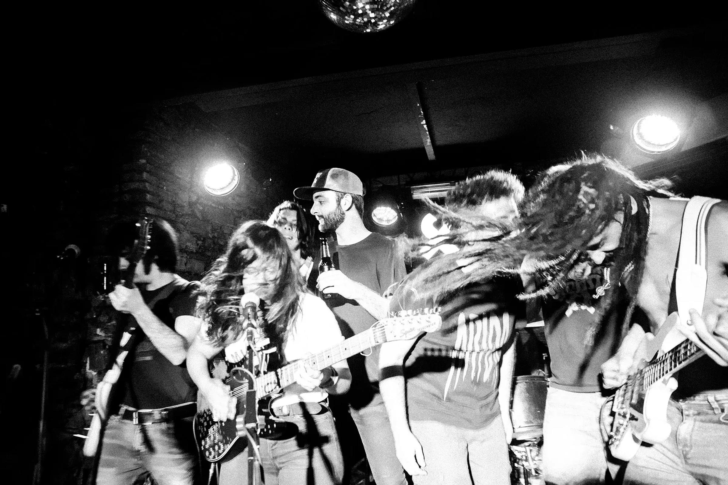
A friend had a hard drive full of concert photographs and nowhere to put them. Sweat, distortion, people losing their heads, shot fast, on instinct. The site had one job: get out of the way.


Gutu shoots gigs. Punk, mostly, and whatever else is loud enough. The archive was strong and completely invisible: years of black and white frames living on a drive, occasionally surfacing on Instagram.
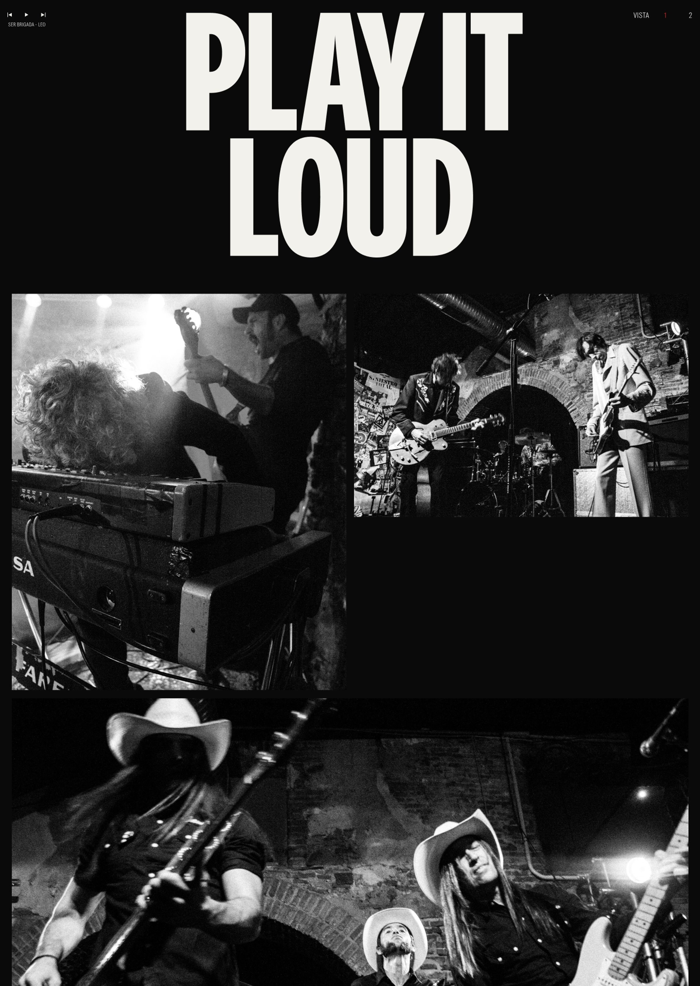

The temptation with photography sites is to design around the images. We designed underneath them.
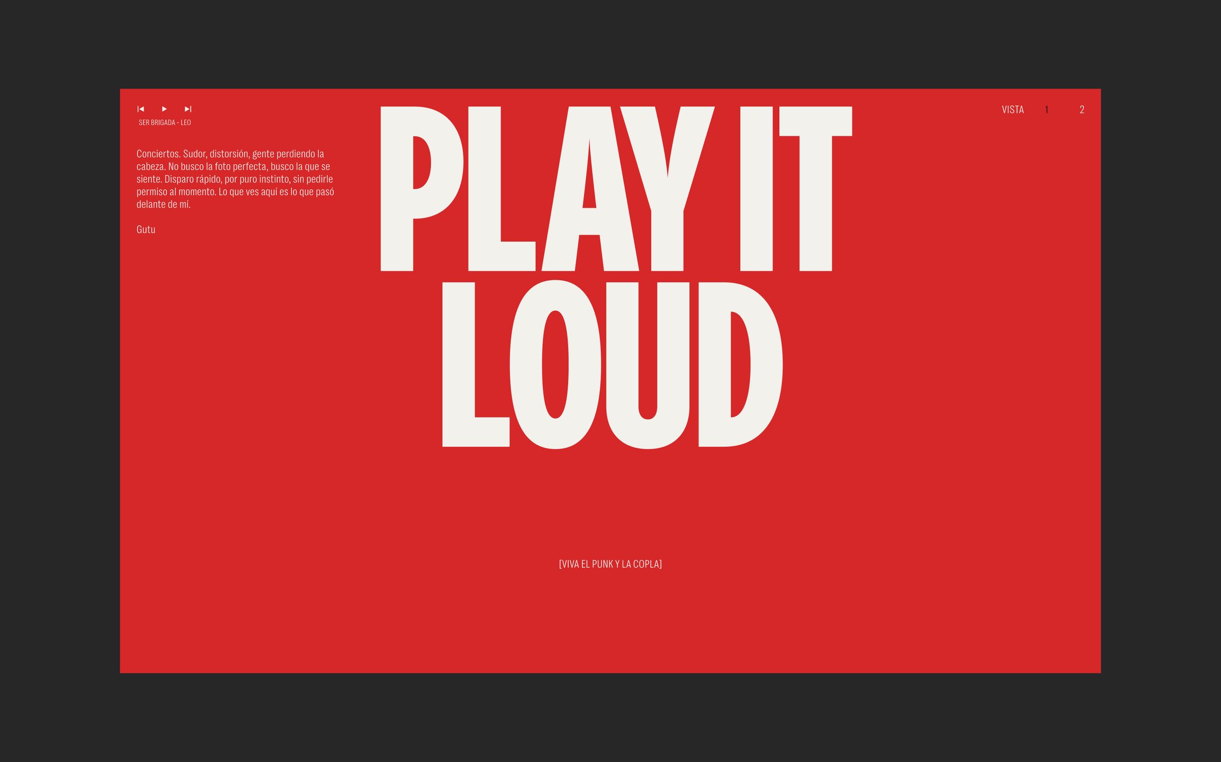
Near-black background, off-white type, one accent colour and nothing else. No chrome, no decorative furniture, no captions competing for attention. Every decision was measured against a single question: does this make the photograph louder or quieter?

The wordmark takes its cue from gig posters and photocopied fanzines: condensed, heavy, set tight.
Everything else stays quiet. One display face for the name, one neutral sans for the rest.

A gallery is a rhythm problem before it is a layout problem. Images are sized and sequenced deliberately. The grid breaks where it needs to breathe, and motion is used sparingly on scroll so the sequence feels like a set list rather than a contact sheet.
Play It Loud is the smallest site we could get away with. No portfolio grid, no about page, no filters... yet.
Some projects are about adding. This one was about knowing exactly how much to leave out.